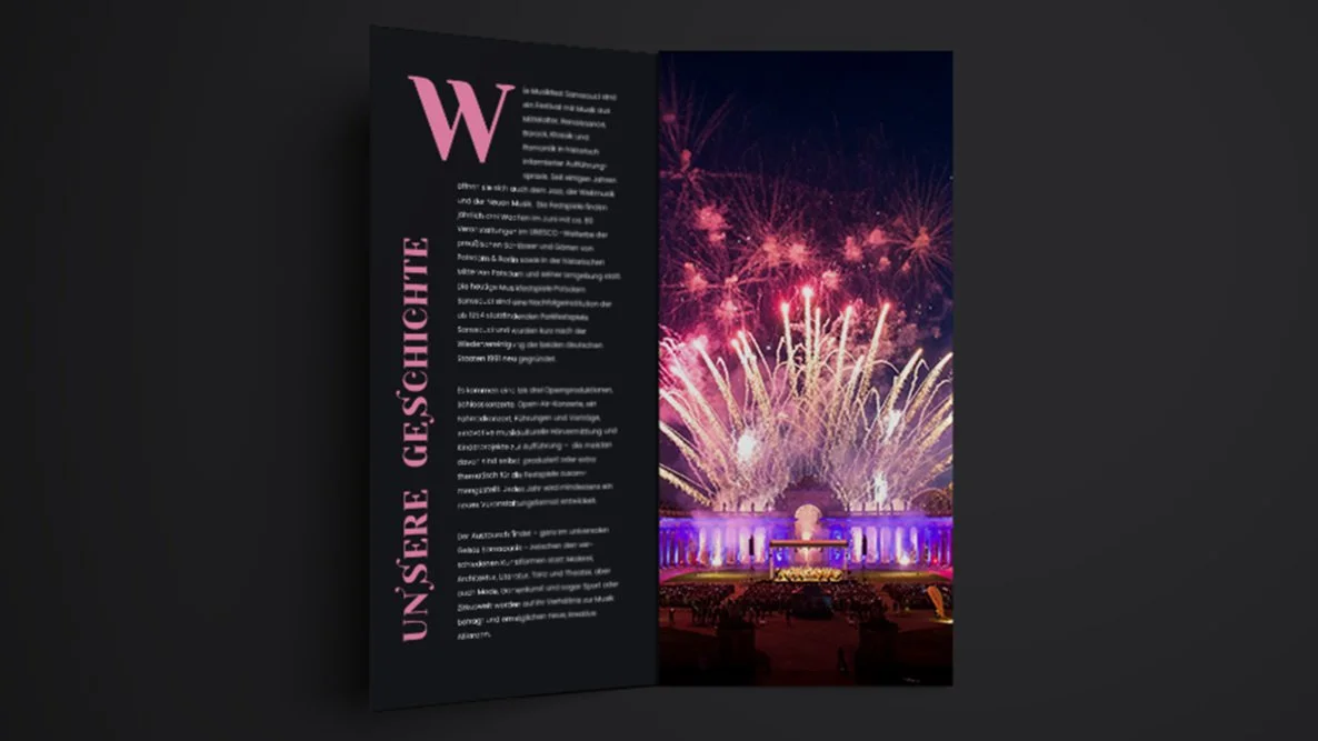
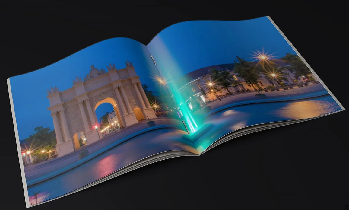
Music festival Sanssouci
5. Semester Opera festival | Corporate Design supervised by Prof. Ralf Weißmantel created by Vivian Williams & Ming Tran
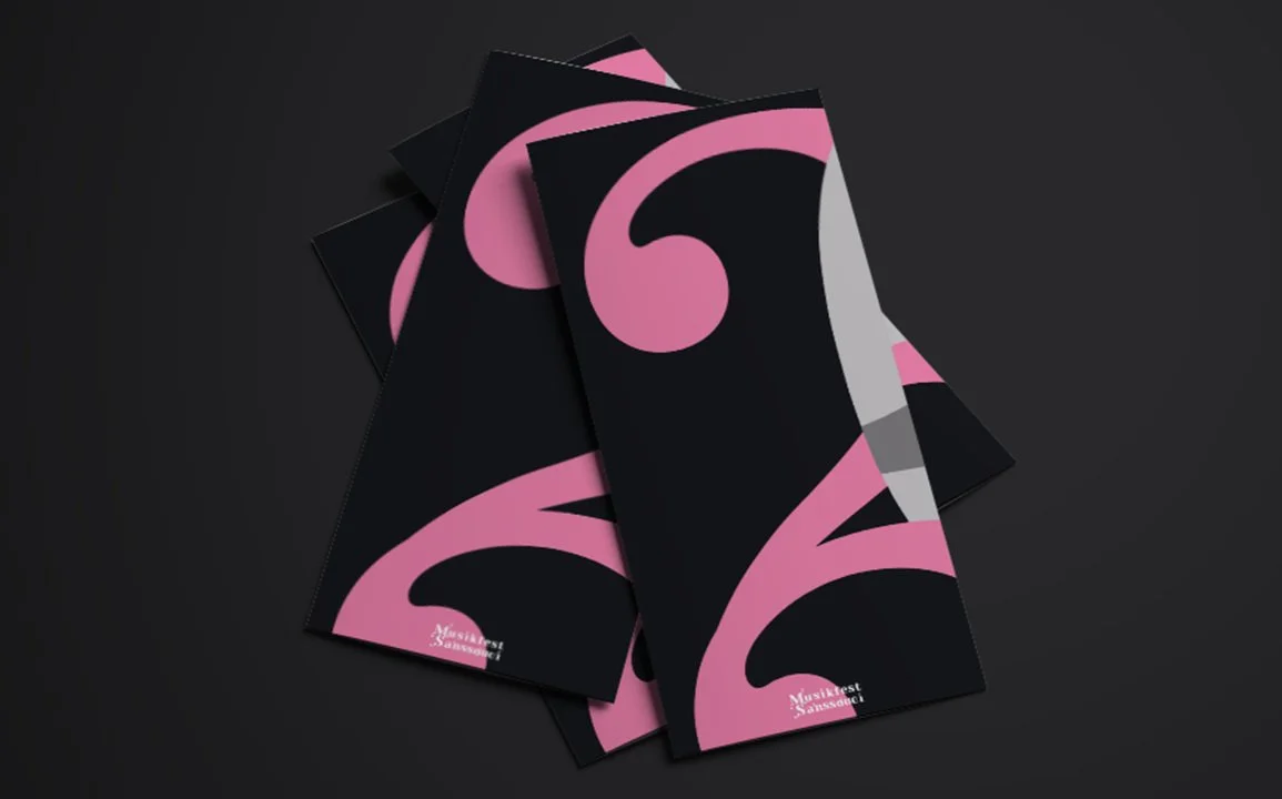
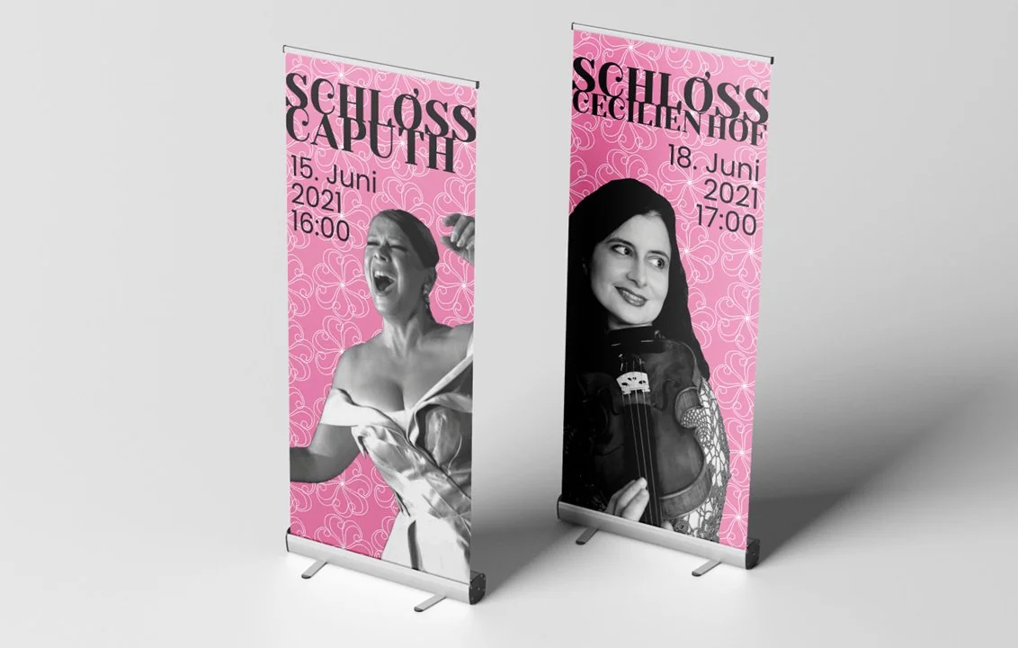
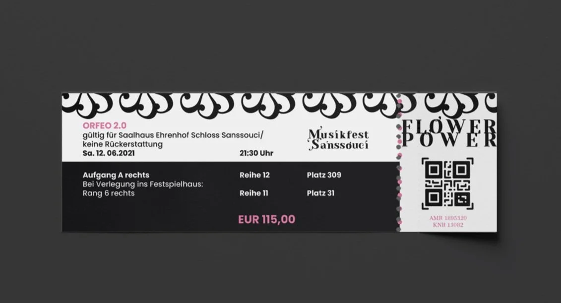
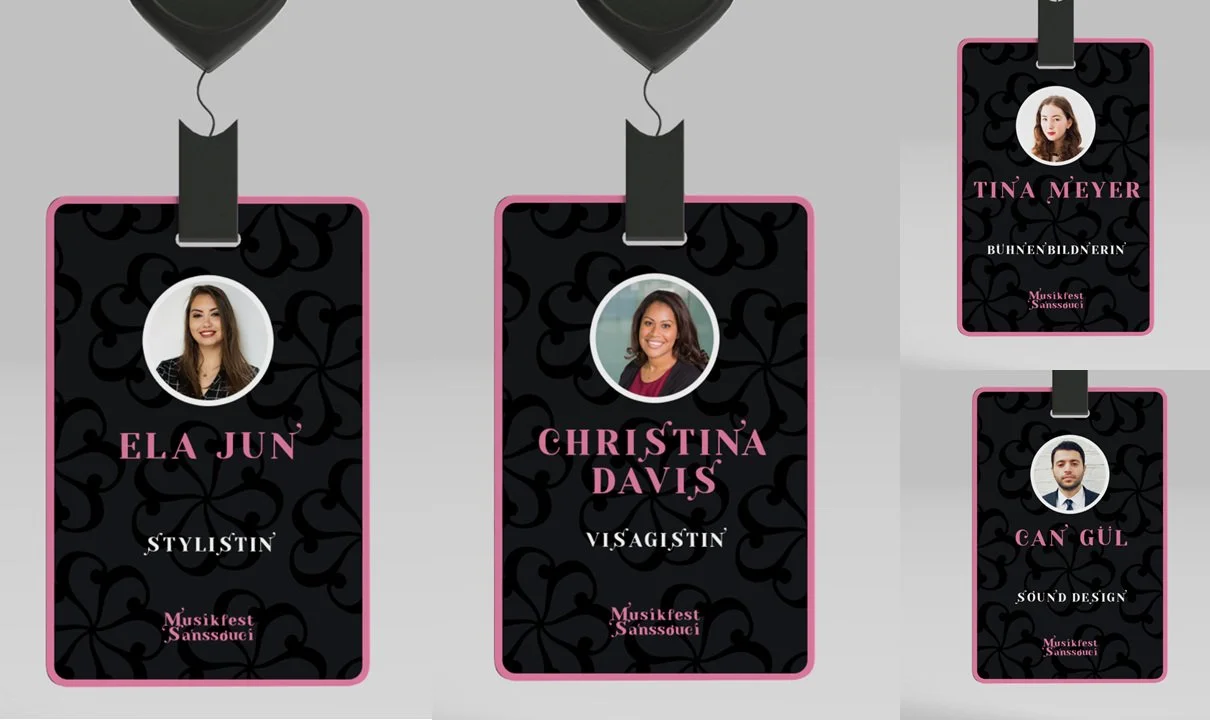
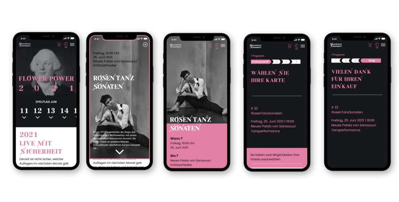
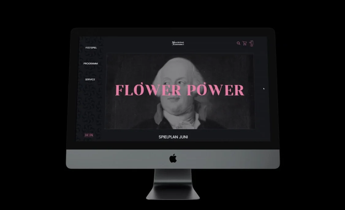
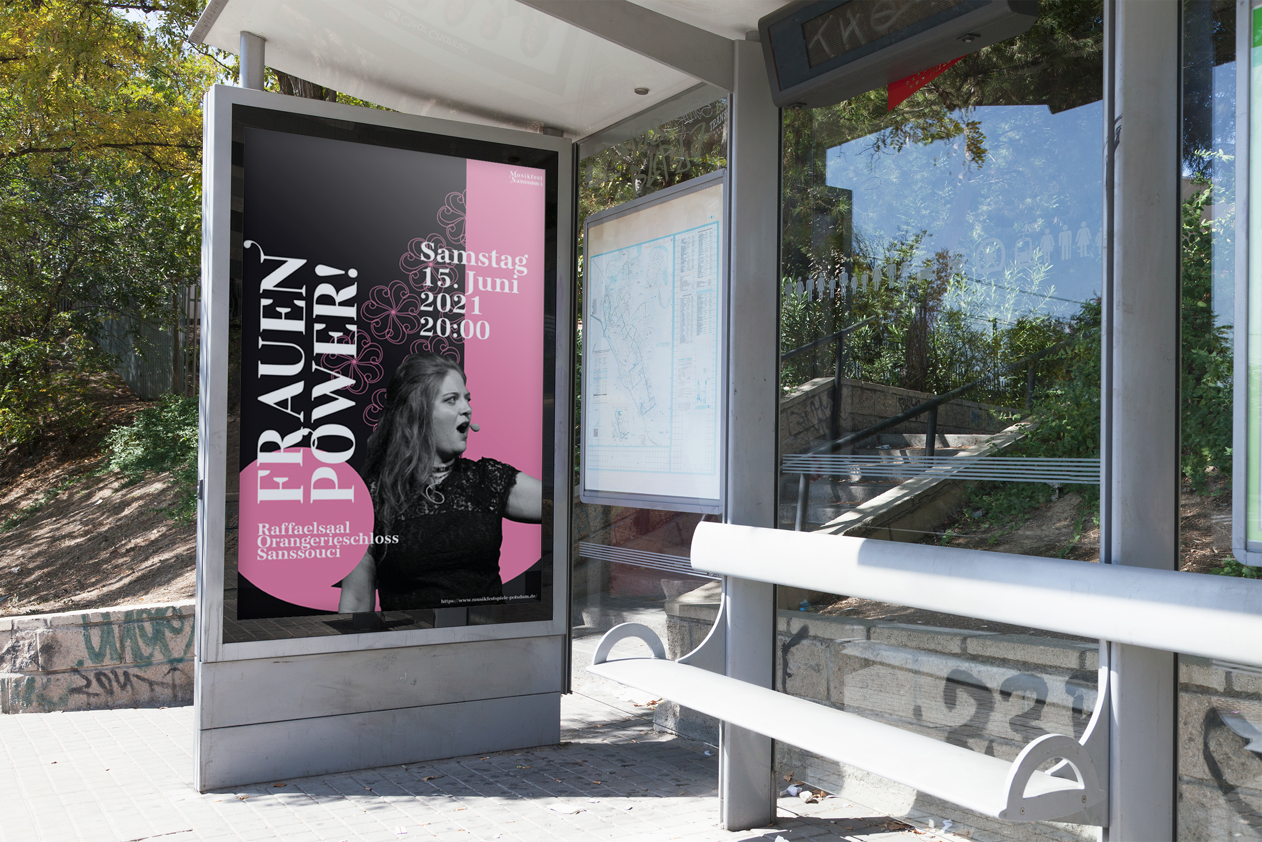
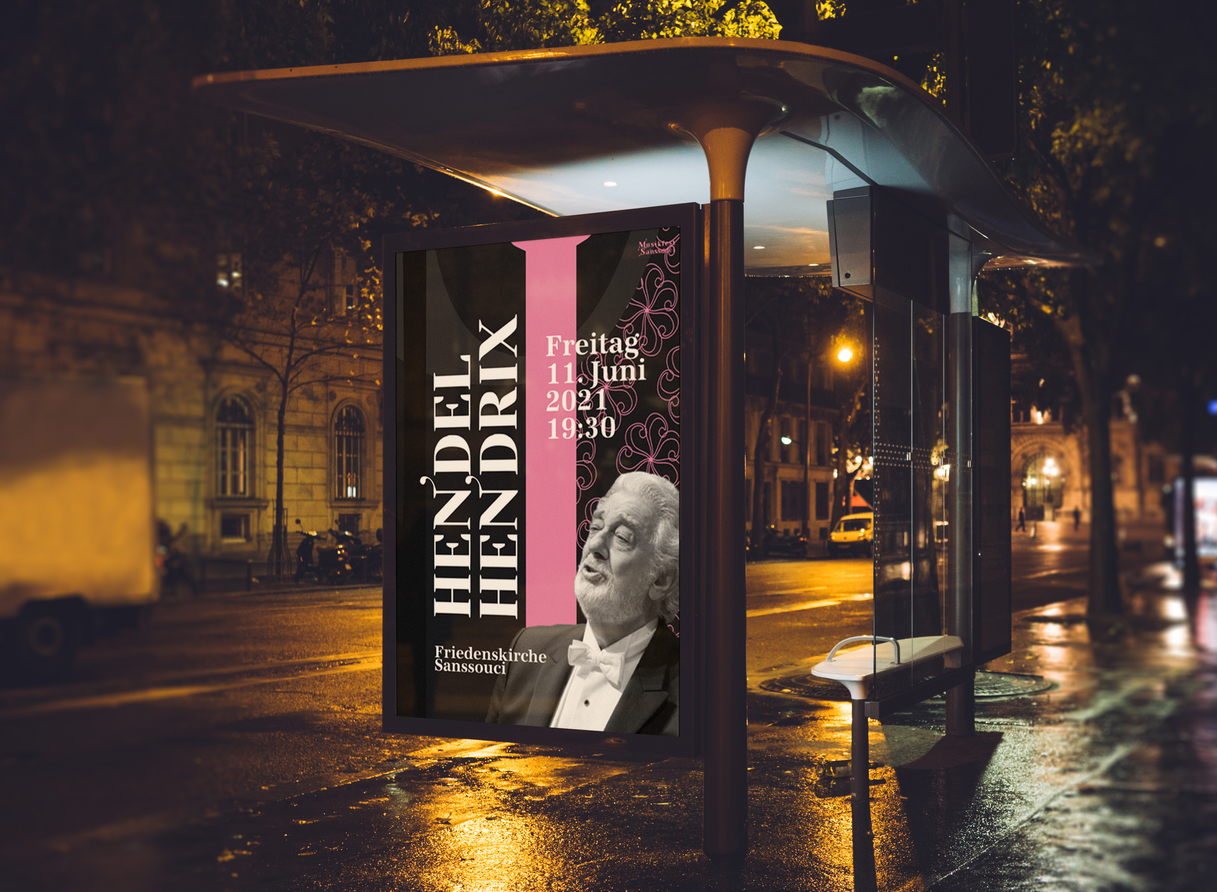
Romantic & Dramatic
With the help of the modified font, the floral ornamentation and the color concept, the appearance communicates what makes opera festivals so timeless and narrative. Visualizing the essence of opera has guided the development and conception of the Projects’s appearance.
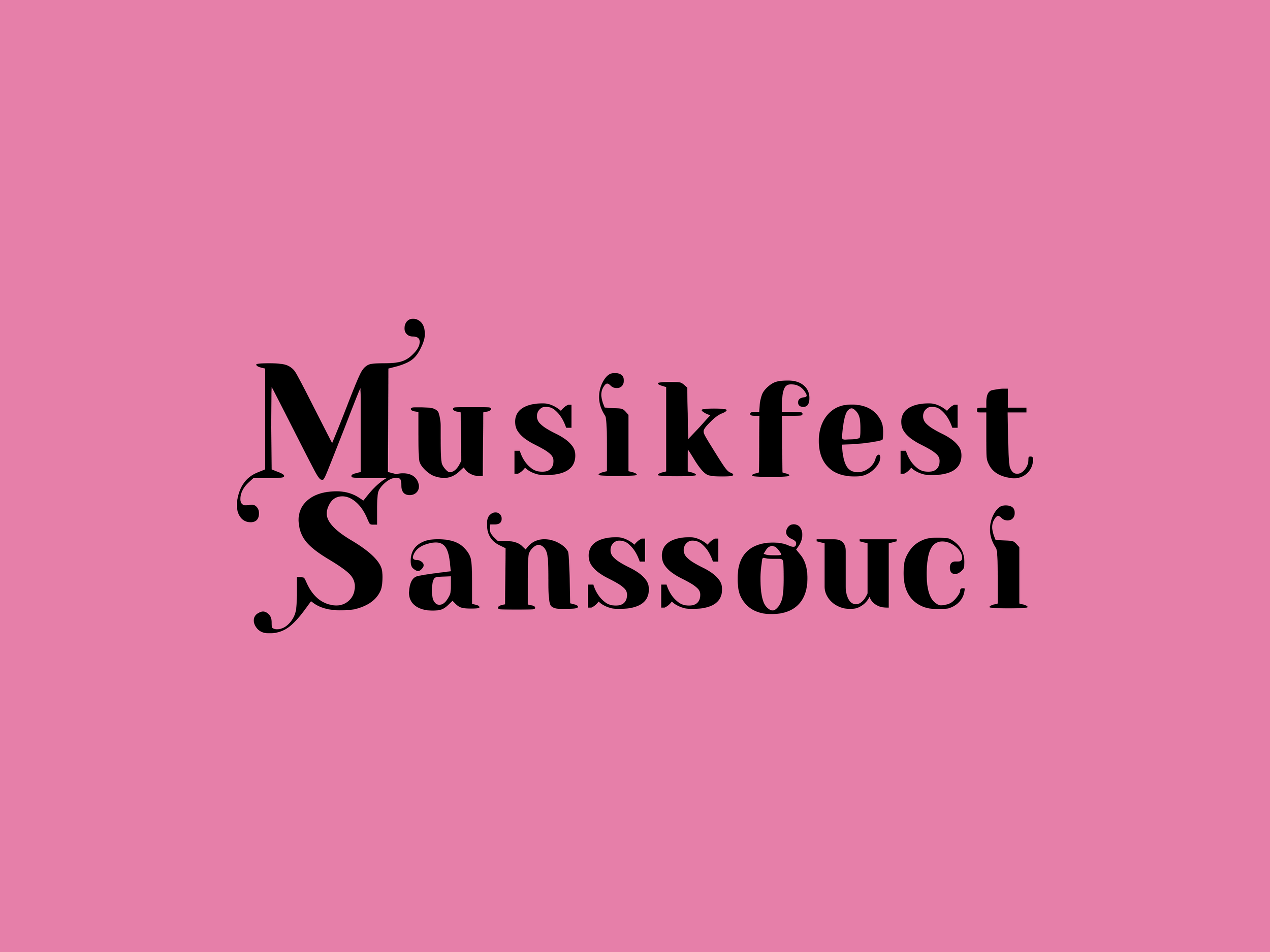
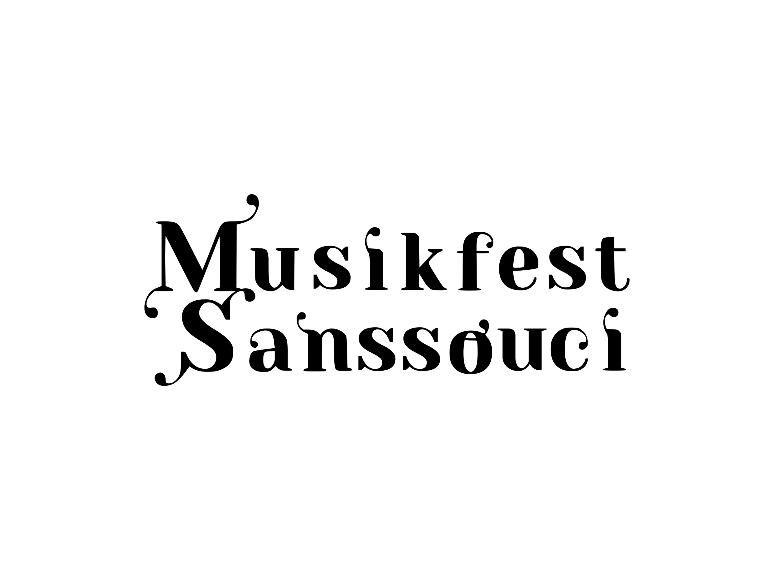
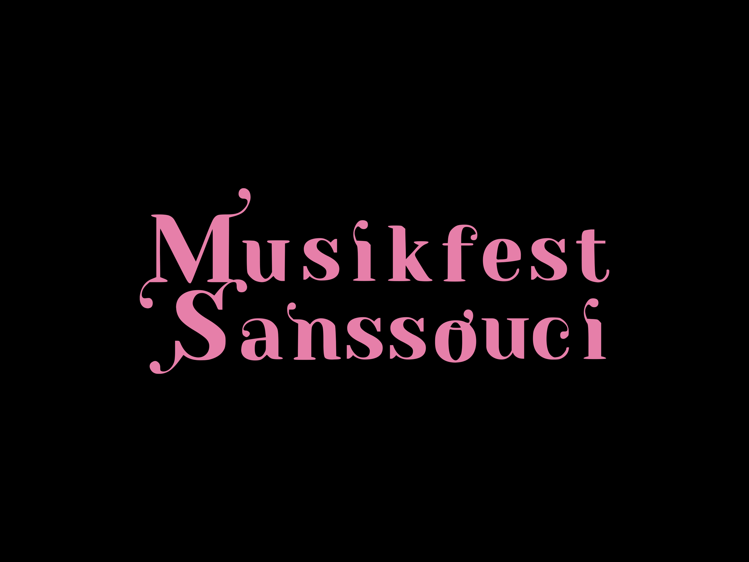
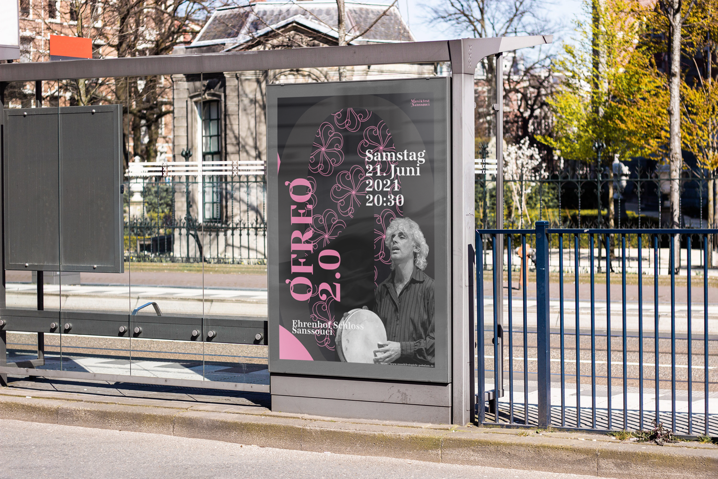
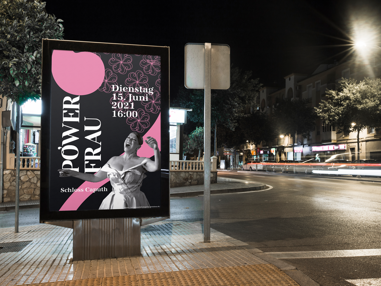
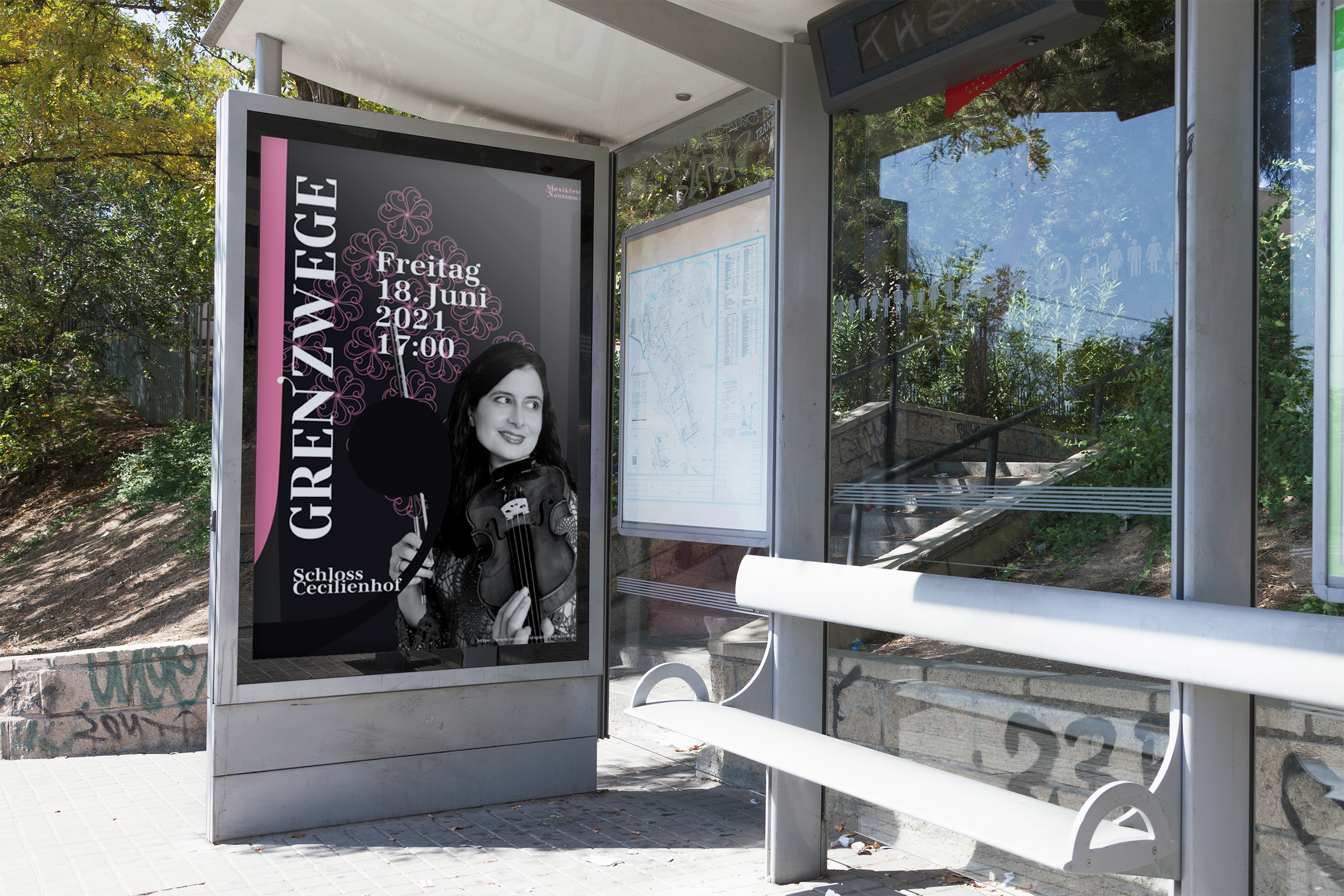
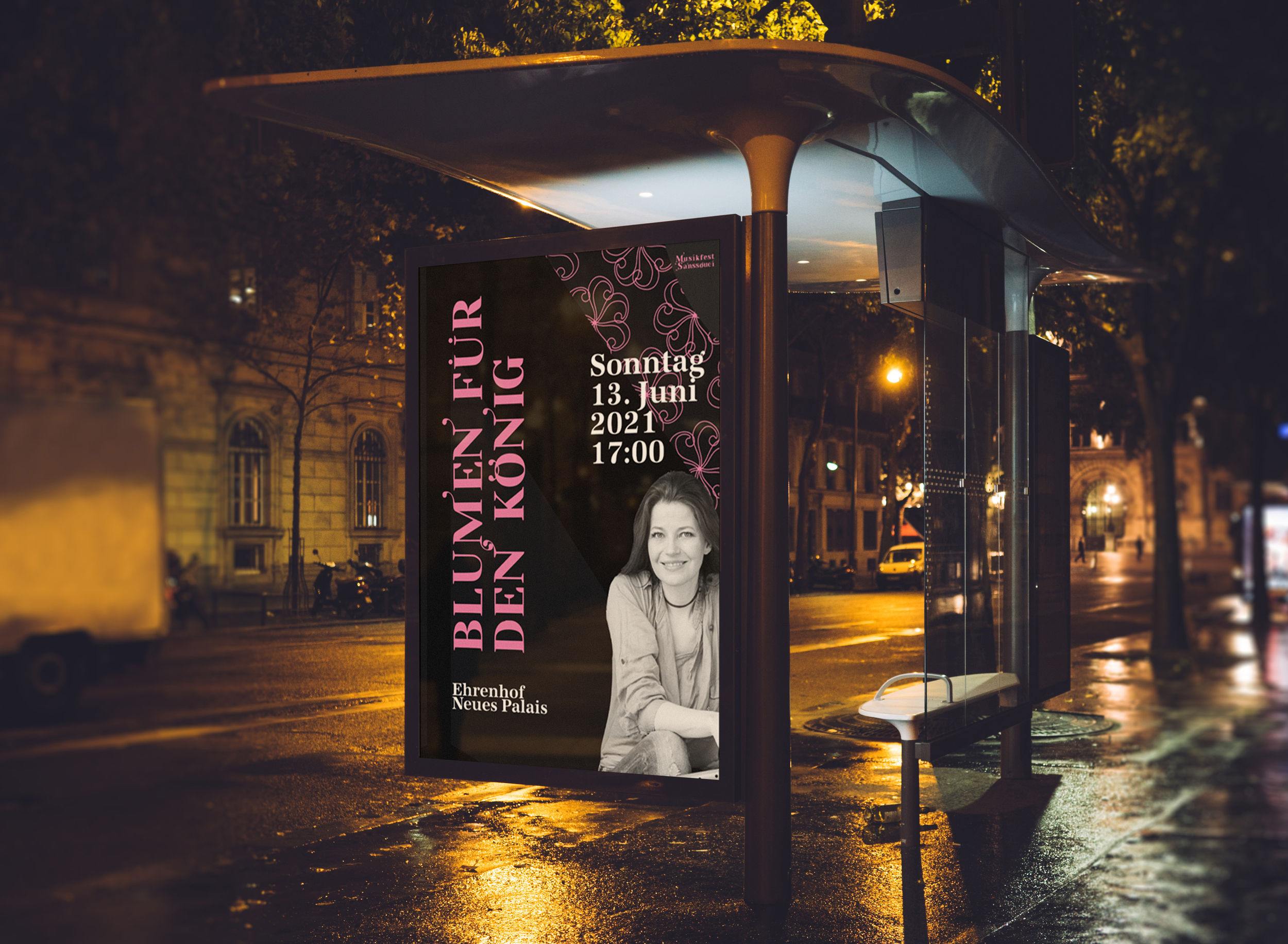
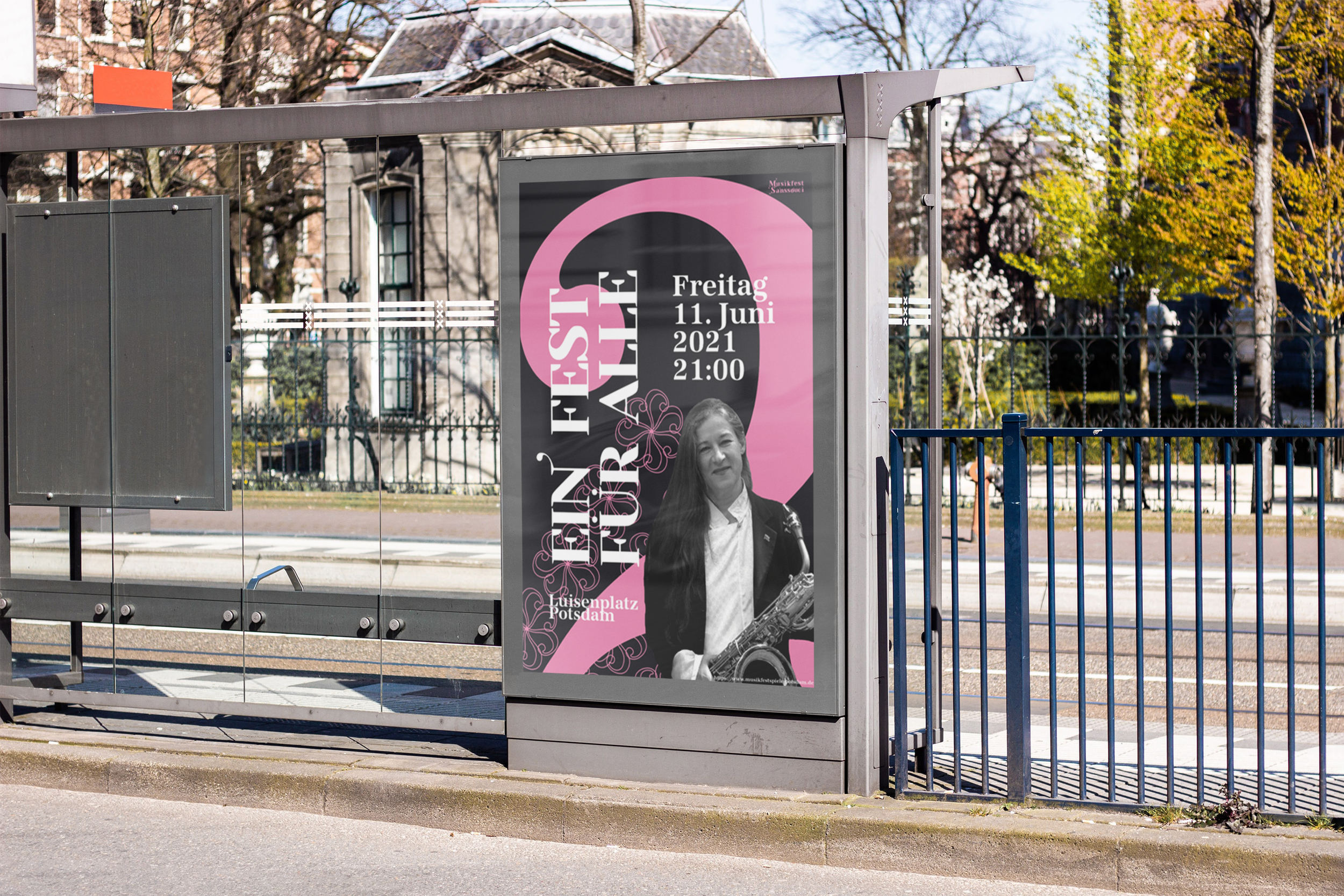
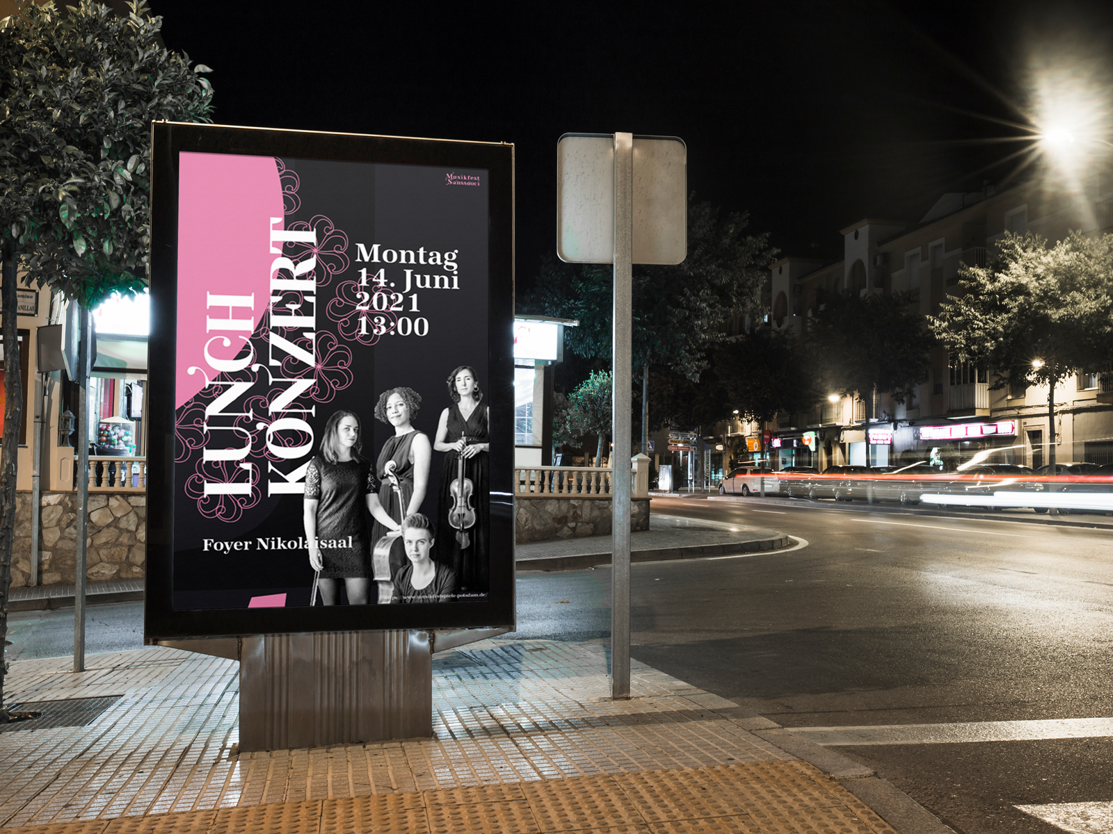
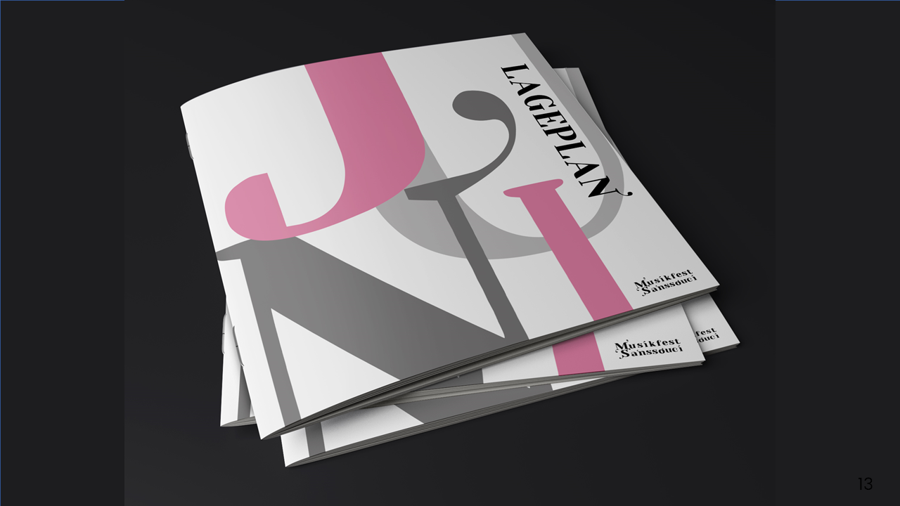

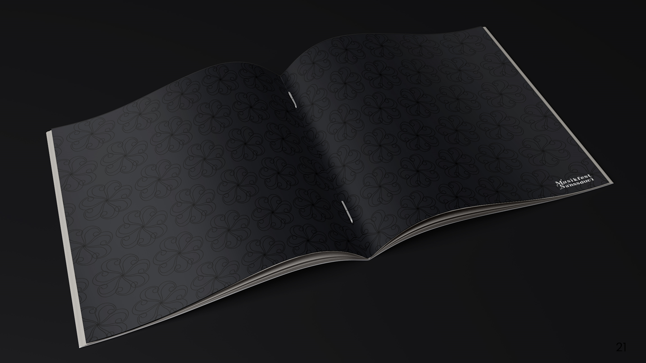
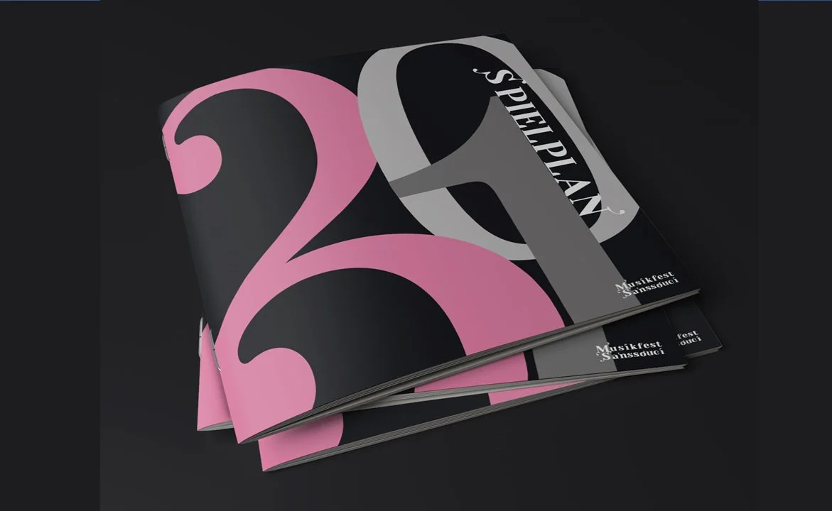
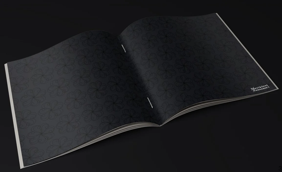
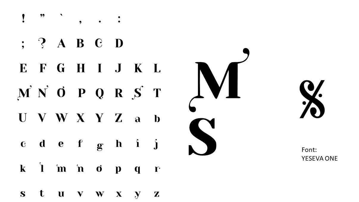
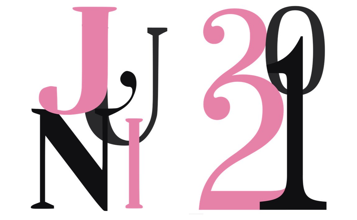
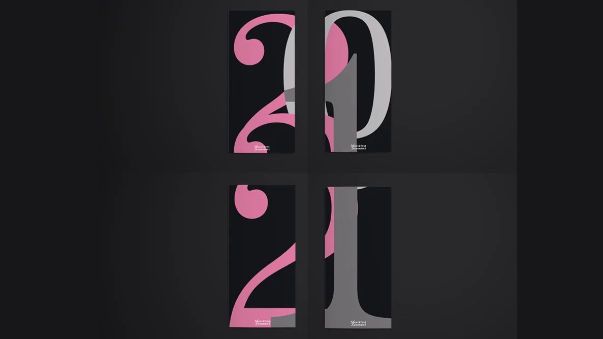
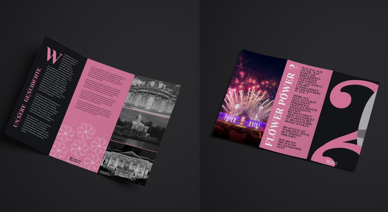
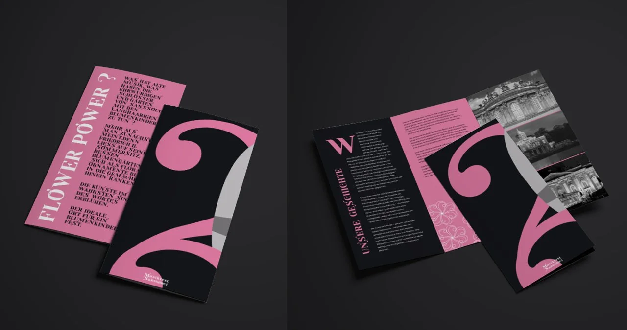
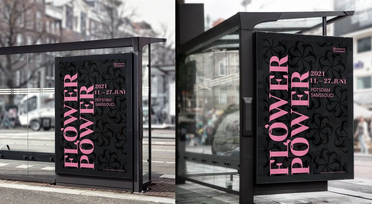
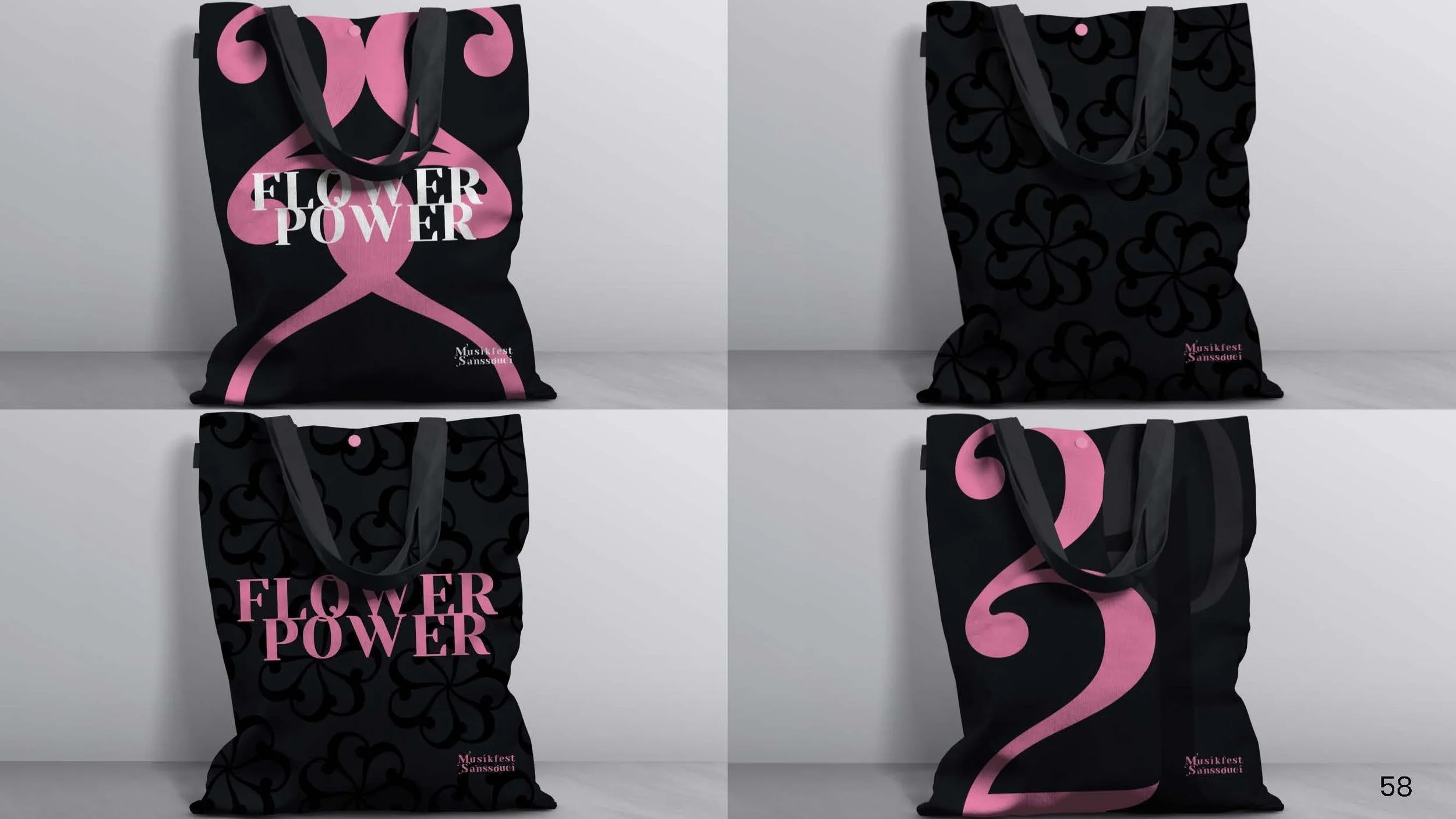
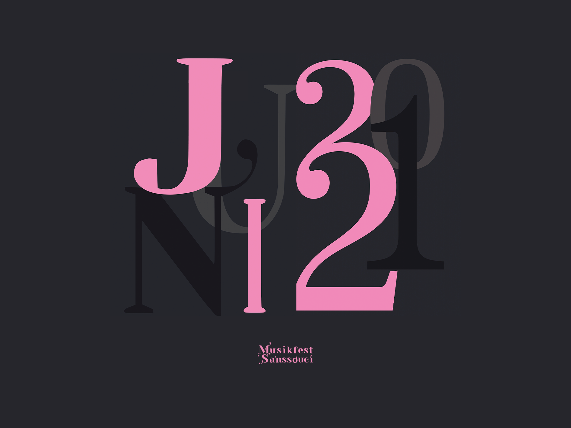
The modified font is based on the ‘Yeseva One’. It is inspired by the musical note and the recurring ornamentation from opera halls.
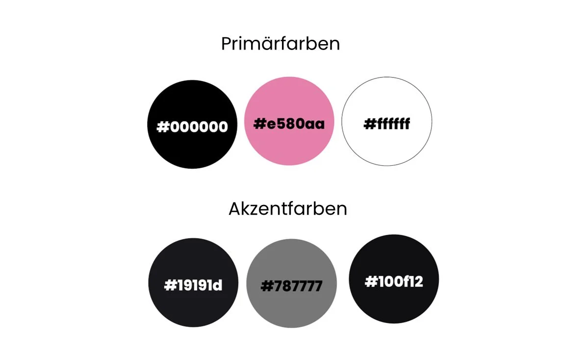
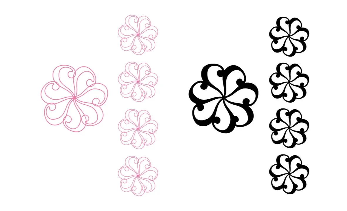
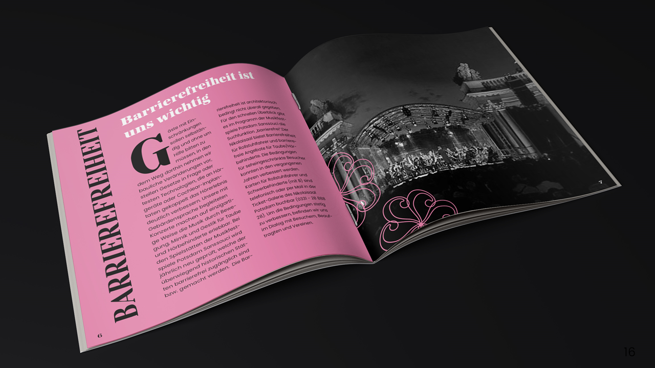
The color pink represents the variable in appearance. It represents the current event theme "Flower Power". In the upcoming years, the primary color would be adaptable to the present event.
The individual leaves of the flowers are based on the "2" from the modified font we used for the Project.